Copy the source
The CLI drops Svelte and CSS files into your repo. Own the implementation, keep the API small, and fork without waiting on a package release.
01A source-first component and chart system for dense tools, local-first apps, admin consoles, and agent-built interfaces that need to stay coherent.
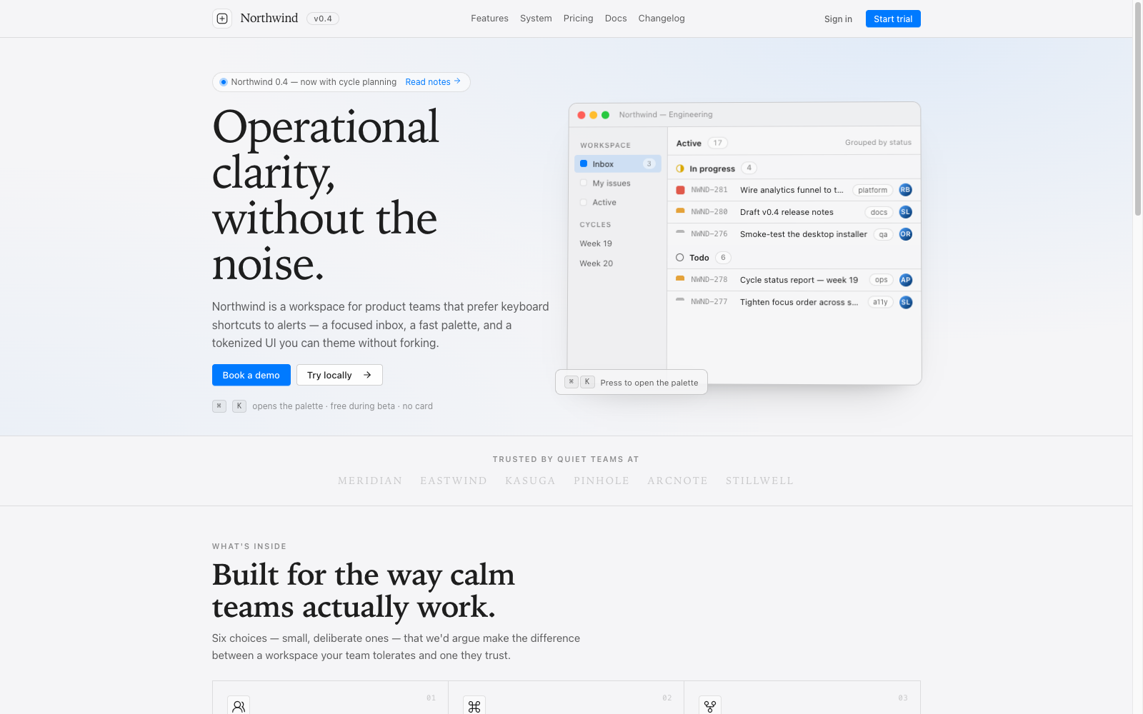
Mittsu uses the same plain, low-friction visual language as the SaaS example: hairline grids, compact controls, earned accent color, and UI that stays out of the way.
The CLI drops Svelte and CSS files into your repo. Own the implementation, keep the API small, and fork without waiting on a package release.
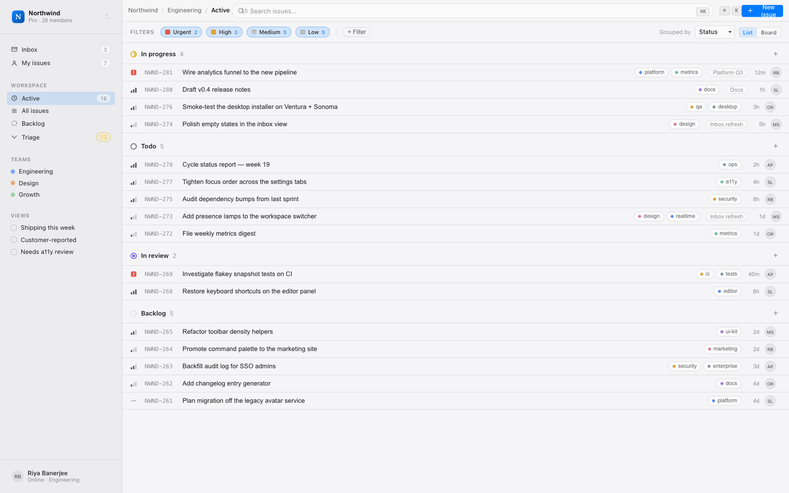
01Sidebars, title bars, command surfaces, status rows, inspectors, and dense tables share one quiet operating-system voice.
02D3-powered SVG charts use the same tokens as the UI kit, so operational data reads like part of the application.
03Materials, foregrounds, lines, radii, focus rings, charts, and semantic status colors are CSS variables you can override.
04Named variants, plain data arrays, and predictable prop shapes make generated screens easier to review and repair.
05Keyboard paths, focus states, aria labels, and headless primitives are part of the baseline rather than a separate pass.
06Materials, text, borders, focus rings, charts, and semantic states all use
the --uin-* namespace. Override the variables,
not every component.
/* Materials flip with theme automatically */
:root {
  --uin-accent:     #3b6cf6;
  --uin-fg:         #1c1d22;
  --uin-mat-window: #fbfbfd;
  --uin-line:       color-mix(in srgb, #1c1d22 12%, transparent);
}

[data-theme='dark'] {
  --uin-fg:         #ebebf0;
  --uin-mat-window: #171719;
}No config spelunking. Scaffold a Vite + Svelte 5 project, let the CLI copy the source in, and you're rendering components in about a minute.
init writes components.json and copies the tokensadd drops component source into src/libtokens.css once, then run dev$ npm create vite@latest my-app -- --template svelte-ts
$ cd my-app && npm install
$ npx @a3tai/mittsu@latest init
✓ wrote components.json + src/lib/styles/tokens.css
$ npx @a3tai/mittsu add button badge stat
✓ 3 components -> src/lib/components/ui
$ npm run dev
-> Local: http://localhost:5173/
Three complete example apps ship in the repo — clone them, run them, and gut them for parts.
Foundations, forms, shell components, overlays, navigation, data views, and macOS-flavored primitives.
Open 4 families 8Area, line, bar, donut, radar, radial, chart frame, and tooltip primitives for product dashboards.
Open start here 6Scaffold a project, install the CLI, import tokens, add components, and wire up icons.
OpenStart with the CLI, then tune the source for your product.